flex가 뭔가요?
Flex
-
.container { display: flex; } - flex 와 grid 는 Css 에서 Layout을 담당하는 속성이다. 그중 flex에 대해 가볍게 살펴보려고 한다.
- CSS Flexible Box Layout is a module of CSS that defines a CSS box model optimized for user interface design, and the layout of items in one dimension. In the flex layout model, the children of a flex container can be laid out in any direction, and can “flex” their sizes, either growing to fill unused space or shrinking to avoid overflowing the parent. Both horizontal and vertical alignment of the children can be easily manipulated.
- MDN의 설명 원문이다. 내가 중요하게 생각한 부분은 flex container, direction 이다.
- flex는 layout container 가 필요하며 방향을 정해야 한다
- 그 물론 세부적인 설정 사항들이 많겠지만 그런 부분은
- 자주쓰는 건 당연히 체득 될거고
- 나머지 필요한 건 어딧는지 알고 넘어가면 될 것 같다.
container 와 direction
-
.container { display: flex; /* 내가 바로 flex container 다! 라는 징표 */ /* flex-direction: row; 디폴트 방향 값 */ } 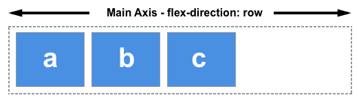
- direction 은 총 네 종류이며 Main Axis 라고 부른다.
- → : flex-direction: row;
- ← : flex-direction: row-reverse;
- ↓ : flex-direction: column;
- ↑ : flex-direction: column-reverse;
Order
- 방향이 정해지면 어떤 순서로 쌓으면 좋을까
- 물론 html이 작성된 순서대로 쌓인다. 하지만 좀 더 섬세한 설정을 원한다면 order 설정을 활용 해볼수 있겠다.
- order 여기서 확인해보면 음수도 들어갈 수 있으며 default 값은 0임을 알 수 있다.
- 활용법 :
- 화면에 순서대로 출력되는 것이 중요한 경우 넣어두면 행여 바뀔 위험은 막을 수 있을 것 같다.
- 동적인 화면 구성하는데 활용 해볼수 있을것 같다. 메뉴에서 선택한 항목이 맨앞으로 가면서 색이 바뀐다는지 하는?
댓글남기기